A heart, standing on a stack.
The mark is the whole idea of Dating API in one shape. The heart on top is the brand members love. The layers underneath are the platform that holds it up. Rose for what members see. Indigo for what we run.

Four versions. Use the first one when you can.
The full colour logo goes on white or Paper. The white version goes on Midnight or photos. One colour versions are for print, engraving and anywhere colour isn’t possible.
 logo.svg · on white
 logo-white.svg · on Midnight
 logo-mono-ink.svg
 logo-mono-white.svg
 logo-stacked.svg
 mark.svg
 mark-small.svg · under 24 pixels
Simple geometry, so it survives anything.
The heart is the classic one: a square turned on its corner with two circles on top. Two cuts run parallel to its lower edges, turning the point of the heart into a stack of layers, like the layers icon every developer knows.
- Clear space: leave at least the height of the API tag on every side of the logo.
- Minimum size: the full logo at 20 pixels high on screen, or 6mm in print. Below 24 pixels, use the small mark, which has one cut instead of two.
- The wordmark: “dating” in Geist, with “API” set in Geist Mono inside a tag, the way developers see code.
- Always outlined: the logo files need no fonts installed.
From a browser tab to a stand at a conference.

 App icons
 Favicon
 Social avatar
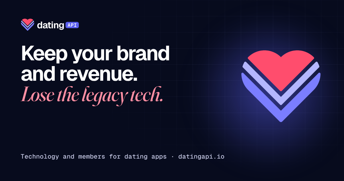 Link preview
Keep your brand and revenue.
Lose the legacy tech.
datingapi.io · See your app rebuilt
Midnight and Indigo do the work. Rose is the heart.
Rose is for the heart and for moments members feel: a like, a match. Use it sparingly and it keeps its meaning.
Midnight#070B1D
Indigo#5B5FEF
Deep indigo#3B3FBF · text
Rose#FF4D6D · graphics
Rose text#D0244B
Paper#F6F7FB
Roughly how much of each, on a typical page:
White 44 · Paper 24 · Midnight 22 · Indigo 7 · Rose 3. Mint #12B76A is for live status only.
A software voice, with one human accent.
Keep your brand.
Headlines, body and buttons. Tight and confident at large sizes.
Lose the legacy tech.
One accent phrase in a headline, never more. It carries the human side of dating.
"matched": true
Labels, numbers, code and data. Everything a developer reads.
An operator talking to operators.
Our readers run dating companies. They’re busy and they’ve heard every pitch. Respect both.
Do Write like this
- Short sentences. One idea each.
- Real numbers, with a date and a source.
- “Members”, not “users”.
- Say what we do, then what it means for them.
- Commas, full stops and colons. No dashes.
Don’t Write like this
- “Leverage our end-to-end solution suite.”
- “Revolutionising the dating ecosystem.”
- Numbers with no source.
- Mocking competitors or their members.
- Promises we haven’t put in the contract.
Four ways to break it.
Recolour the layers
✕ Don’tRotate or tilt the logo
✕ Don’tPut the colour logo on rose or busy photos
✕ Don’tAdd shadows, glows or outlines
✕ Don’tEverything, ready to use.
SVG for screens and print. PNG where a platform needs it.